Post by Bingbing Fan on Nov 14, 2011 11:06:08 GMT -5
Hello Girls
Welcome to Fourth Elimination for this cycle. Group with the highest scores will safe from elimination this week. While, a model from each losing two group will have to leave this competition
Let's start our judging session
TEAM YELLOW (ESTELLA, FREIDA & MISCHA)

BB: I love the using of Black color as background because it give contrast to the Silver color and make it pop out more. The styling isn't great. But what I love about this photo is your face. I think your face is very strong. I think you look confident. Just be careful with the pose. I love your hand gesture but make sure it do not cover up your face. Work on the angle more
Amanda: I don't like this. The quality is low, the pose is iffy, the hand is a problem, there's a logo in the corner, and your eyes don't do much for me. I just can't bring myself to like this much, sorry :/
Matt: I dont like the quality of this photo and your face just looks weird. Looks as if one eye's bigger then the other and your facial expression looks like your trying to go to the bathroom. But i do like the color of the dress
Nicki: I'm unsure of how I feel about this photo. On one hand, the dress and your face are great, however, the your hand and the quality is low. I'm worried about you this week...

Amanda: My first observation is that you picked gold and aren't wearing any jewelry. When I think gold, I think of earrings, necklaces, bracelets and such made from the stuff. Without the jewelry here, this makes it plain. It's so zoomed in that we don't get as big of an impression of the color as I'd like - I can't speak for my colleagues. I do like your hair and eyes, but aside from that this is just boring and not colorful enough. We want more than one shade of gold here! We don't want you to just pick the color of your dress. Unfortunately, I think you should be worried this week.
BB: Yup, the color itself was too limited here. I wish we could see the gold color more here. The styling is good and I love what you doing with your mouth here. Very relax and calm. But I think you should inject more the Gold element in this photo
Matt: Very pretty, the color is very out and about which is good and i can see the model in this picture
Nicki: I was expecting a bit more when I heard Gold... this is very plain.

Amanda: I'm not completely sure about this. Your expression is a bit blank, your hair hides your neck, and it just seems bleak since it's white. I'm also not a fan of the headband - I never am - and although I like the horse and the pose, nothing else is really doing that much for me. It's decent, don't get me wrong, but I don't really love it and this is when you start needing to make an impression. Hopefully you can survive!
BB: I'm not sure about this too Mischa.. I think your face look very weak here. I can't see the energy. I like the using of color though. I just wanna see more from you. I want a photo that make me say "WOW" when I see it for the first time.
Nicki: While I'll agree that your expression is weak, I think you had a wonderful use of a prop, and that should help a lot!
Matt: I dont think of White as a color but i honestly think of plain and boring and this is sort of that. I like the horse but it sort of blends in with the background and your facial expression is so blah.
TEAM PURPLE (GEMMA, JENNIFER & MARIA)

Nikki: Gemma, I am not sure about this one. I don't like anything about this photo below your belly button, but I do like your top and the background. Your hair is also only okay, but your eyes aren't anything stunning either. Sorry :/
Amanda: Normally when I see something (ocean aside) in monochrome blue, I start feeling blue myself. This sort of constitutes a risk because of that. This is really a lot like calming waters - everything about it is relaxing and sexy. The leg is a little awkward, though, and the color is almost overwhelming to the point it distracts from you, but it isn't that bad at all. I still really like it and you should have no problem making it to next round.
BB: The bottom half for me is too sexual.. But I really like the Upper half. Your face is very strong. I see the attitude and I think you executed the color very well. I'm feeling the blue..
Matt: I'm going to agree with the whole bottom half being sexual but that's part of being a model. I like the color in this picture. But there is something with your eyes i dont like.

Amanda: Now I do appreciate that you're trying to shake things up and not be so pouty and blank, because that's what we want to see.
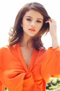
However, I think this is a little over-the-top. I really hate how your dress covers your eye, and the red mouth is more a focal point than anything else here. With the pink background, the yellow sort of fades away, and you could have asked Maria to make that thing a light yellow if you couldn't do it yourself. That would have taken the overwhelming background out and improved the image a lot. As much as I like that you're taking a risk and changing things up, this is a bit too awkward and as much as I want to like it, I can't bring myself to. Sorry :/
Nicki: J-Law, in the recent weeks I haven't been a fan, but I certainly am this week. My only problem with this is that your mouth is prominent, but I think it's a vast improvement on past weeks. The dress is largely original, and yellow. So good job!
BB: I really like it actually Jennifer. I feel this is totally a different side of you. Before this I saw you as sweet and bubbly girl but here, you are sexy, confident and energetic. But I do agree with Nicki. Watch your mouth, in this photo, it looks a little bit hoochie. You don't want to be label as hoochie but sexy.
Matt: This is prob my fav from all of yours so far. Love the coloring but the one problem would be it seems that there was a giant flash and it just makes you look very pale.

Amanda: I'm glad you took the time to blur that logo. It's a lot less overwhelming like this, and although still noticeable it really isn't a problem. As for the shoot, I do admit it is a little over-the-top in terms of flash sexuality, but you make a strong argument that this is red, and this picture does embody a fire inside of you. It's a great shoot, I'm just worried that it's a bit TOO raunchy.
BB: Yup.. It's too raunchy for me.. The way you style the dress is too over the top for me. But I think you executed the color well. I felt the fire and passion in this photo.
Matt: Like i said to another model this is the point of modeling, some times looking hot is what is needed. I do think that that coloring, the pose and the background match the color of red really well with it like fire.
Nicki: I actually really like this, Maria. I think you personified red well in multiple ways, so good job on my end!
TEAM BROWN (RIHANNA, SELENA & SHILPA)

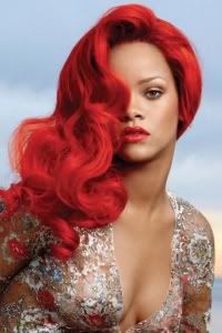
BB: Your emotion in this photo is very strong. I love the body language. Very flirty and strong. It's very alien-ish for me but in a good way. This is remind me to Uma's shot in Cycle 1
Amanda: I love it. Sexy, vivid, memorable. Good pose and fierce expression. I really have nothing more to say than that, so good job!
Nicki: Rihanna, this is awesome. Easily your best yet. Great job!
Matt: My favorite Photo so far. I love the color and the pose and it's just so vibrant!
BB: I love the pose. It reminds me to Michael Jackson's pose. Your face is interesting. Not the best angle but I love the attitude. Very confident, cocky and sexy at the same time. The using of color is great too.
Amanda: I think you should have cropped this a bit, because right now it's pretty wide and that takes the focus off you. The pose is strong but I am iffy about the face. The lighting is good, especially considering the color is black, which on its own is a risk. It's still good, though, so I don't think you should have a problem.
Nikki: Cropping this a tad would have helped, however, it's still very strong. Good job!
Matt: I like everything about this. Your pose, face and the color!

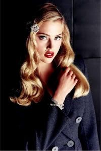
BB: I see the watermark.. But it's small so I can get over that. I didn't like this photo at first (sample). But this one looks better than the sample one.
Maybe, because the zoom is better now and the quality also better than the samples one. The styling is simple but the whole concept save your photo.
Amanda: I take issue with that watermark, really, since it's strapped across your photo and sort of distracts from you; however, removing it would be a pain in the rear, so that's fine.
The pose is great and the face is calming, like blue should be. Aside from the watermarks, I think this is a good photo, but those watermarks are so distracting that it'll cost you some points. I don't expect you to have a problem staying, though!
Nikki: I think that you could have won this week if it weren't for the watermark. I still think you did a great job, though!
Matt: I really like the blue in this photo. The pose is a little awkward but i love your facial expression.
Welcome to Fourth Elimination for this cycle. Group with the highest scores will safe from elimination this week. While, a model from each losing two group will have to leave this competition
Let's start our judging session
TEAM YELLOW (ESTELLA, FREIDA & MISCHA)
BB: I love the using of Black color as background because it give contrast to the Silver color and make it pop out more. The styling isn't great. But what I love about this photo is your face. I think your face is very strong. I think you look confident. Just be careful with the pose. I love your hand gesture but make sure it do not cover up your face. Work on the angle more
Amanda: I don't like this. The quality is low, the pose is iffy, the hand is a problem, there's a logo in the corner, and your eyes don't do much for me. I just can't bring myself to like this much, sorry :/
Matt: I dont like the quality of this photo and your face just looks weird. Looks as if one eye's bigger then the other and your facial expression looks like your trying to go to the bathroom. But i do like the color of the dress
Nicki: I'm unsure of how I feel about this photo. On one hand, the dress and your face are great, however, the your hand and the quality is low. I'm worried about you this week...
Amanda: My first observation is that you picked gold and aren't wearing any jewelry. When I think gold, I think of earrings, necklaces, bracelets and such made from the stuff. Without the jewelry here, this makes it plain. It's so zoomed in that we don't get as big of an impression of the color as I'd like - I can't speak for my colleagues. I do like your hair and eyes, but aside from that this is just boring and not colorful enough. We want more than one shade of gold here! We don't want you to just pick the color of your dress. Unfortunately, I think you should be worried this week.
BB: Yup, the color itself was too limited here. I wish we could see the gold color more here. The styling is good and I love what you doing with your mouth here. Very relax and calm. But I think you should inject more the Gold element in this photo
Matt: Very pretty, the color is very out and about which is good and i can see the model in this picture
Nicki: I was expecting a bit more when I heard Gold... this is very plain.
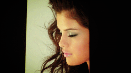
Amanda: I'm not completely sure about this. Your expression is a bit blank, your hair hides your neck, and it just seems bleak since it's white. I'm also not a fan of the headband - I never am - and although I like the horse and the pose, nothing else is really doing that much for me. It's decent, don't get me wrong, but I don't really love it and this is when you start needing to make an impression. Hopefully you can survive!
BB: I'm not sure about this too Mischa.. I think your face look very weak here. I can't see the energy. I like the using of color though. I just wanna see more from you. I want a photo that make me say "WOW" when I see it for the first time.
Nicki: While I'll agree that your expression is weak, I think you had a wonderful use of a prop, and that should help a lot!
Matt: I dont think of White as a color but i honestly think of plain and boring and this is sort of that. I like the horse but it sort of blends in with the background and your facial expression is so blah.
TEAM PURPLE (GEMMA, JENNIFER & MARIA)
Nikki: Gemma, I am not sure about this one. I don't like anything about this photo below your belly button, but I do like your top and the background. Your hair is also only okay, but your eyes aren't anything stunning either. Sorry :/
Amanda: Normally when I see something (ocean aside) in monochrome blue, I start feeling blue myself. This sort of constitutes a risk because of that. This is really a lot like calming waters - everything about it is relaxing and sexy. The leg is a little awkward, though, and the color is almost overwhelming to the point it distracts from you, but it isn't that bad at all. I still really like it and you should have no problem making it to next round.
BB: The bottom half for me is too sexual.. But I really like the Upper half. Your face is very strong. I see the attitude and I think you executed the color very well. I'm feeling the blue..
Matt: I'm going to agree with the whole bottom half being sexual but that's part of being a model. I like the color in this picture. But there is something with your eyes i dont like.
Amanda: Now I do appreciate that you're trying to shake things up and not be so pouty and blank, because that's what we want to see.
However, I think this is a little over-the-top. I really hate how your dress covers your eye, and the red mouth is more a focal point than anything else here. With the pink background, the yellow sort of fades away, and you could have asked Maria to make that thing a light yellow if you couldn't do it yourself. That would have taken the overwhelming background out and improved the image a lot. As much as I like that you're taking a risk and changing things up, this is a bit too awkward and as much as I want to like it, I can't bring myself to. Sorry :/
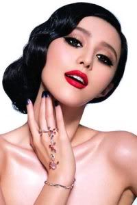
Nicki: J-Law, in the recent weeks I haven't been a fan, but I certainly am this week. My only problem with this is that your mouth is prominent, but I think it's a vast improvement on past weeks. The dress is largely original, and yellow. So good job!
BB: I really like it actually Jennifer. I feel this is totally a different side of you. Before this I saw you as sweet and bubbly girl but here, you are sexy, confident and energetic. But I do agree with Nicki. Watch your mouth, in this photo, it looks a little bit hoochie. You don't want to be label as hoochie but sexy.
Matt: This is prob my fav from all of yours so far. Love the coloring but the one problem would be it seems that there was a giant flash and it just makes you look very pale.
Amanda: I'm glad you took the time to blur that logo. It's a lot less overwhelming like this, and although still noticeable it really isn't a problem. As for the shoot, I do admit it is a little over-the-top in terms of flash sexuality, but you make a strong argument that this is red, and this picture does embody a fire inside of you. It's a great shoot, I'm just worried that it's a bit TOO raunchy.
BB: Yup.. It's too raunchy for me.. The way you style the dress is too over the top for me. But I think you executed the color well. I felt the fire and passion in this photo.
Matt: Like i said to another model this is the point of modeling, some times looking hot is what is needed. I do think that that coloring, the pose and the background match the color of red really well with it like fire.
Nicki: I actually really like this, Maria. I think you personified red well in multiple ways, so good job on my end!
TEAM BROWN (RIHANNA, SELENA & SHILPA)
BB: Your emotion in this photo is very strong. I love the body language. Very flirty and strong. It's very alien-ish for me but in a good way. This is remind me to Uma's shot in Cycle 1
Amanda: I love it. Sexy, vivid, memorable. Good pose and fierce expression. I really have nothing more to say than that, so good job!
Nicki: Rihanna, this is awesome. Easily your best yet. Great job!
Matt: My favorite Photo so far. I love the color and the pose and it's just so vibrant!
BB: I love the pose. It reminds me to Michael Jackson's pose. Your face is interesting. Not the best angle but I love the attitude. Very confident, cocky and sexy at the same time. The using of color is great too.
Amanda: I think you should have cropped this a bit, because right now it's pretty wide and that takes the focus off you. The pose is strong but I am iffy about the face. The lighting is good, especially considering the color is black, which on its own is a risk. It's still good, though, so I don't think you should have a problem.
Nikki: Cropping this a tad would have helped, however, it's still very strong. Good job!
Matt: I like everything about this. Your pose, face and the color!
BB: I see the watermark.. But it's small so I can get over that. I didn't like this photo at first (sample). But this one looks better than the sample one.
Maybe, because the zoom is better now and the quality also better than the samples one. The styling is simple but the whole concept save your photo.
Amanda: I take issue with that watermark, really, since it's strapped across your photo and sort of distracts from you; however, removing it would be a pain in the rear, so that's fine.
The pose is great and the face is calming, like blue should be. Aside from the watermarks, I think this is a good photo, but those watermarks are so distracting that it'll cost you some points. I don't expect you to have a problem staying, though!
Nikki: I think that you could have won this week if it weren't for the watermark. I still think you did a great job, though!
Matt: I really like the blue in this photo. The pose is a little awkward but i love your facial expression.
 I really hate doing this.. but I'll see you in Sequester House.. Please check the board.. You know how i felt about your photo. *Hugs Jennifer. See you at the Sequester House