|
|
Post by Freida Pinto on Nov 10, 2011 20:18:59 GMT -5
|
|
|
|
Post by Amanda Kimmel on Nov 10, 2011 21:02:52 GMT -5
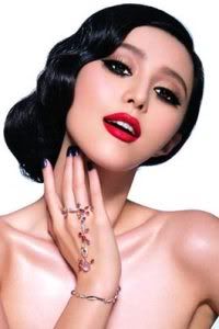
Amanda: The magazine cover is good, but that dress looks to be a bit too much for me and your expression is a bit too vacant. The spread seems grainy, but after that it's pretty good. I can't find anything wrong with it, but I can't find anything that sticks out to me, either. Overall, these two are just okay.
|
|
|
|
Post by Bingbing Fan on Nov 10, 2011 22:49:38 GMT -5
BB: The styling for the Cover one a little bit messy.. Look 'heavy' on you but I love the whole concept. You face should be more stronger. I knew you can do better than this. As for the Spread, I think it is a good shot. You look very flirty and innocent at the same time. I love the concept.
|
|
|
|
Post by Matthew James Thomas on Nov 11, 2011 11:39:22 GMT -5
Matt: The cover = beautiful but the only thing i dont like is your mouth it's shaped weird but other than that its great. The spread is very simple and i like that. I love the hair and the pose.
|
|
|
|
Post by Nicki Minaj on Nov 11, 2011 18:24:17 GMT -5
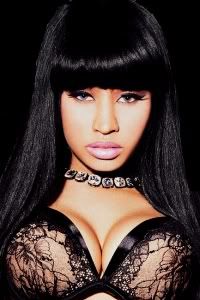
Nicki: I'm not a huge fan of the cover because you look spaced out. I do like the spread, though. Good job on that!
|
|
|
|
Post by Karen Gillian on Nov 11, 2011 19:50:50 GMT -5
Karen: It's true, you do look kind of bored in the cover, but everything else in the photo is simply astounding.
The spread, ech, I hate the quality. In fact, I've hated on the quality of every spread this round, so I'm just going to stop saying that, because apparently this is just a universal thing with spreads or something. Anyway, the pose is good, but the facial expression definitely puts me in the mind of zombies, and that's never a good thing unless you're modelling for a Halloween photoshoot.
|
|