Post by Bingbing Fan on Nov 6, 2011 5:10:11 GMT -5
Hello Girls!!!!
Welcome to your First Judging Session. This cycle, we're going to face a lot of "Doubles" and this week, you girls have to deal with Double Theme.
Let's start our judging session


Matt: I love the smile It's so sweet and Innocent like you said. Perfect.
The Black and white one is just okay for me. I love your facial expression but i'm not really a fan of the dress.
Karen: I definitely am surprised by the smile photo. Angelina usually looks so stiff and regal, so it's nice to something a little more innocent. I do wish that it was bit bigger, and that we could see more of your body, because it makes your arm a bit awkward, but it's a good shot overall.
The black and white is a bit more serious in nature, but it's a gorgeous high fashion shot, it showcases your sensuality very well, and the accessories really enhance your beauty nicely.
Amanda: I like both of these. The Smile shot is, as has already been said, sweet and innocent and definitely the kind of thing we wanted to see. The arm is a little awkward, and I'm wondering if Brad said something funny.
The black and white shot is good but not great. I'm not a fan of how you have your hair since it almost looks like you have a pixie cut, but I do like your dress and the setting. It's overall pretty good
Bingbing: I think the smile one is very natural. You look really beautiful, sweet and fresh. I'm really impressed with you.
For the B&W, I must said that I'm not the biggest of fan of the photo because I think there's nothing catch my eye toward this photo. You just stand there and there were nothing memorable about it
Nicki: I really enjoy this smile shot. It's sweet and innocent just like you said!
The black and white is okay... I wish you were a little more fierce in it!


Amanda: Your smile is great, although a tad overdone. It's a pure head shot so you're front and center and your pearly whites steal all the attention. Good work!
The black and white I am uncertain about. You have a very fierce expression, but you're sort of covered up a bit too much by that scarf. I know someone is going to take a huge issue with it - and well I am too. The scarf is sort of the attention here - you're almost covering your mouth with it, and it just doesn't seem to fit. Everything else is good, but... the scarf robs it from being a solid photo. Nothing to worry about though!
Bingbing: I think you did great for the smile. The smile looks very natural and calm. I love the big hair. Very cute for you. Bey...
As for the B&W, I love the fact that you decide to use the same hairstyle. The eyes are intense. I love that. But the styling for me is a little bit off. You look "heavy" and the scarf kinda irritating me because it hide your neck. I WANT YOUR NECK!!!!
Matt: I'll agree i really love that your front and center. a little over done but still cute
B&w: I love your facial expression but i'm not fond of your crazy hair
Nicki: I love this smile shot. You're front and center and definitely a star.
The black and white shot is just okay. The scarf and hair take away from the fierceness of your look.
Karen: Alright, I'm running late and I don't wanna hold things up, so I'ma be brief. I think the smile is cute, and definitely shows off your face well. The hair is nice, but I've got a personal hatred for the afro style. It looks kooky and un-model-like, and I just don't like it.
The black and white is very intense, and you've got a great facial expression, but the scarf does hide you a bit, and that's unfortunate. Well done all around, though.


Matt: Hm, I'm not too sure what i think of this photo. The smile is sort of odd and the pose is just weird. I don't think its bad just doesnt work well for me.
This looks sepia and that's what did Kelly last season. Your facial expression looks like your kind of bored.
Amanda: Is that even a smile? You look like a movie villain here... and that evil grin is not the kind of "smile" we were hoping for.
For the B&W, Pretty much this. Although with you're and not your.Not really much else to say.
Nicki: I'm not a huge fan of this smile shot, either. It's very okay. You look more cunning here than anything else.
Nicki: I think black and white should be about fierce looks, and your look here is not fierce. Not a fan, sorry.
Karen: It's an interesting take on the smile, but I wish that this was more of a close-up on you, because we can't really see your face or hair terribly well. I think that with everything being black, we kind of lose your body a bit, too, which is unfortunate.
B&W - It's an interesting pose, but I don't really see the sepianess that you're all talking about. Maybe I'm colorblind. Either way, it's definitely not as coloured as Kelly's was, so I don't care. The facial expression could be a lot stronger, and I'm not really a fan of hats in general for these things, (sorry, Amanda!) but it ties in with the trench coat very well. The pose is strong, and it's reasonably sexy and high fashion, so my feelings are mostly positive.
Bingbing: I think the smile is very subtle. The pose didn't help you much either. But you have potential, Estella. I expected you to perform better than this. I think this is not Estella that I want because I think you're so gorgeous.
For the B&W, What is Sepia by the way? That word was really similiar to my mother's name, Sepiah.. I missed my mom. I need to call her asap. Back to your photo. Your face a little bit weak for me. I can't felt the energy. And the pose, you need to work on there more. You need to sharp it a little bit. This one is very average for me


Amanda: Very strong smile shot here, but that logo bugs me, as does your shirt. It looks like you're just wearing straps around you at first (you aren't). Overall, it's very good and seems very genuine.
The black and white... I don't know about it. The pose is strange and a bit too zoomed in, so I don't get a clear sense of what's going on here. The arm is just weird and I have no idea what you're holding. I'm also iffy on the lighting and what we can see of your face.
Your smile shot is definitely enough to get you good marks, so worry not!
Bingbing: For your smile shoot, I think you should tone it down a little bit. The smile is too wide for me and it look kinda corny for me. But the styling is great. I love the hair, earring and you look very commercial here.
And for the B&W, I like it. I think there's a story behind that photo. There are hope, love and calm elements in this one. You look very beautiful here.
Matt: Yeah I agree about the smile. Tone it down. It's nice but it's huge!
Black and white: I love it! It is really well and I can feel like it's speaking to me
Nicki: I'm a huge fan of your smile shot. It feels genuine, and that's what we want to see.
Your black and white has good and bad qualities. I don't like that I can't see all of your face, but the emotion translates well.
Karen: I agree about the weirdness of the smile's outfit. My first thought was that somebody tied you up, and you were outrageously happy about it, for some reason. But it's a cute smile, and I love your hair, so the outfit thing really isn't anything to worry about.
The black and white shot is absolutely gorgeous, and I love pretty much everything about it. It's alluring and vulnerable, and isn't too high fashion in the sense that we judges sit around going "gank" and have to figure out what the hell it's supposed to mean. Great job!


Amanda: Your Black and White photo is great - it's something different, though you look a bit too much like a statue. I know that's what you're going for, but it's not all about you. It's not lively. A black and white photo could make up for its lack of color by being lively, by being memorable.
Your smile photo... I find it creepy. Your face looks scary more than anything, especially due to how you're playing with your hair. I can't really bring myself to like it, though I don't think it's horrible. I get that you struggled with it, but I was expecting something a bit more... vibrant, for the word you used.
Bingbing: Yup I agree with Amanda, your B&W photo is so unique, The outfit and the setting really blend with each other. However I still think you can improve your face expression in this one
As for the smiling one, unlike Amanda, I like it. I really do. I can feel the energy from you and you look very fresh. I love that. I think a nice first week for you
Matt: Yeah I agree with the Black and White one. It's really good. It's very artsy.
The smile on the other hand isnt so great but it's still a smile!
Nicki:Black and White: I'm a huge fan of this photo. I love the uniqueness.
Smile: This is just okay. Your face seems low-res, or something. But you are certainly smiling!
Karen: The smile one is pretty cute, but the angle makes your arms look like Arnold Schwarzenegger's, which makes it a bit awkward. I like the hair and the smile itself, though, so no worries.
The black and white is very fierce, and I love how the camera angle contributes to that. I wish it was a tad bigger, but it's still very, very good.


Matt: two different photos and that's what i like about it.
The Smile is cute. Its good but not amazing.
The BW is sexy but i'm not a fan of your facial expression.
Amanda: Your smile seems overdone. We only see the top row of your teeth, and I think that makes it really awkward and unnatural. I don't love it, either, but it's at least decent.
The black and white pose is GREAT and quite memorable, but at the same time it's also kind of strange. Your face does bug me too, and the angle just doesn't fit well for some reason. It's not bad by any means, again just in the middle of the pack.
Bingbing: Yup the smile is too much and look awkward but you look fresh here which is why i'm quite impressed with this photo.
For the B&W, I agree with Amanda. I can see your potential here. The legs is really pretty. And the pose is very unique and memorable. Good Luck
Nicki: I think the smile is okay. Part of it seems somewhat forced. Just not entirely sure about it.
I love this black and white photo, however, SO fierce. SO sexy. Great job.
Karen: I like the smile, and the pose is good. We really focus on you, and that's exactly what we asked for. Great work!
The black and white I'm a little iffy on. The facial expression almost looks more annoyed than sensuous, which doesn't really line up with everything else that's going on here. The pose and the outfit are fantastic, though, so it's still a great shot.


Bingbing: Helle Jennifer. Can I just call you JLaw? Love to see the First Timer. They are so fresh... As for your photo, I love the smile. It's not too much and the styling is great too. Very simple but yet still elegant. You look very classy here. My only advice is the tag. You should crop that part out. But I'm totally understand. This is your first time here. So it is forgiven
As for the B&W, I genuinely really impressed with you. You look like a Goddess here. Please nickname yourself Jathoteneus Goddess or something now.. The styling is very great. And your emotion totally contrast with your smile photo. I love this one
Amanda: I know you're a first timer, and you probably know that I'm critical of a lot of things xD
I'm not totally fond of the smile photo. The logo is distracting, but since this is your first time that's fine. The main issue I have is your eyes. They seem to be a bit of a contrast to your happy smile, so the photo ends up as somewhat neutral, somewhat forced. The smile is pretty, though, and that's what we want.
The black and white one... wowza. It's a very stunning, memorable photo, but I do have one issue with it - your face hardly takes the spotlight and that's due to the weird lighting. The glare on the right side is sort of a problem, because it distracts from you. The pose and outfit though are amazing, and this photo alone ensures that you are safe this week.
Matt: Your smile is cute but it's seems a little crooked/off but it's still very cute.
the BW one is amazing but like Amanda said the light is a bit distracting but still amazing.
Nicki: I think your smile is cute. It's good, but not great.
I love this black and white photo. It's fierce and you knocked it out of the park.
Karen: "Jathoteneus"? Bingbing, there aren't any sausages here! Anyway, I like the smile, but I feel like it's a little bit closed off, and not really genuine. But the hair is great, and I love that the necklace matches your eyes and really makes them pop. It's little things like that that turn a good picture into a great one.
The black and white is very artistic, but the glare on the right hand side kind of detracts from you a little. The pose is good and the outfit is spectacular, though, so great work!


Amanda: For your smile shot, it's really awkward. You look like you're just staring at the camera and opening your mouth like you're singing. Your eyes also bug the hell out of me. I don't see that as a smile. I don't know what it is, but I'm getting serious vibes from the first Taylor Swift way back in Cycle 1, who butchered the Smile theme similarly.
The black and white photo also doesn't do much for me. It's low quality, and it's also kind of... slutty. I do like your hair, but how it covers your eyes is kind of scary, especially when mixed with that facial expression. The garter belt is also a bit of a distraction since it's the darkest thing there, and that's not what you want it to be.
I'm going to take a guess here and say that you just chose the first images you came across and didn't think things through and compare them. That is NOT how you make it far in this competition. Don't rush things, scour and look them over. I do hope you take this advice to heart, but I think you could be in a lot of trouble this round...
Matt: Every thing about your smile picture is awkward. Your eyes are weird and when i look at your mouth i dont see much of a smile.
I like the black and white it's very cute and innocent.
Bingbing: Yup Kendra.. The smile one is not that good. Really awkward and the styling is off somewhere.
But, I genuinely like your B&W photo. I didn't expected it from you. The dress is gorgeous and I love your face. I can feel the attitude and you look really fierce here. Good job for this one
Karen: The smile one is definitely a bit questionable, and the outfit comes across as seriously skany to me, but I've seen worse.
The black and white is very impressive. You've got a nice sort of sultry look going, and I think the outfit and pose are both very nice.
Nicki: The smile shot comes across as skanky because the smile is awkward, and your dress is just too skimpy and distracting.
I think the black and white is all-right, but it needs higher resolution.


Matt: Your black and white is amazing...
your smiling on the other hand is a bit too cheesed out and it's just a tad awkward
Amanda: The black and white photo has a great backdrop - it's a great setting and a great pose, although the hat is kind of strange with it. It sort of makes your face even more awkward, if you know what I'm saying, but I really like it regardless.
I'm with Matty on the Smile one. It's cheesy and awkward, and the way you have your arm around your neck just doesn't seem to fit, and I know someone who is about to give you even more hell for that than I am. That aside, it's still at least okay, so I don't think you should be worried.
Karen: The black and white photo is simply amazing. I think the pose and the outfit are astounding, and the background is fantastic.
With the smile, though, it does seem a little bit forced, and it doesn't really look terribly much like you. But I like the lighting and the pose, and it's still pretty good. Well done!
Bingbing: I thought I see a nipple at first for you B&W but it's not and I've to agree with the judges. I love your confident in this photo. Yup, it's a little bit hoochie but that's your identity. The setting is undeniably beautiful.
As for the smile one, it's a little bit forced for me. I think you look ameteurish in this photo. I think you can do better than this
Nicki: I definitely see the smile as awkward. Just not enough genuine happiness.
The black and white photo is great, however, though I wish I could see a bit more of your face.


Amanda: I like the smile. I can't find anything wrong about it, but I also can't find anything too memorable about it. It's good, but not something that completely wows me. In the later rounds, as you're well aware, you're going to need to wow us, and this is enough to get by.
The black and white is good, but again not overly memorable. You're just staring at the camera, holding your hair. There's nothing unique to make up for the lack of color, and although that's not a problem, it's not a major one. The expression is good, not great, and the outfit is okay. There's really not much for me to say about it.
Bingbing: I think the smile one is very beautiful. You look very fresh and commercial in this one. The styling is very hip and young. Gorgeous.
I like your face for the B&W but the styling, dress especially look very average. It's okay but boring and not memorable at all.
Matt: The Smile is beautiful you look like the definition of a Barbie Doll... love the outfit
The black and white, It is very boring but it is an amazing black and white i like it.
Nicki: I think this smile shot is great. Everything just flows nicely and look natural- good job.
The black and white is just all right. I think you have a bit too much make up on, and there should be more focus on your face.
Karen: I love your smile in this! You look adorable, and everything from the pose to the outfit is just sweet and innocent. I really like it.
The black and white, I love the fierceness of your facial expression, and the hair is delightful, but the outfit really makes your entire body look weird, and the effect is really off-putting.


Bingbing: *Die, *Reborn, *Die, *Reborn... Stop!!! OMG!!! This is what I expected from you girl. The smiling one, you look very natural and beautiful, nothing awkward or force about that. The setting was brilliant. Very Commercial
Meanwhile for the B&W, I'm totally love the concept. Very artistic, fierce and memorable. Those other bitches are so going to hate you right now, cause you're the one to beat RiRi
Matt: I enjoy the smiling one a lot but the one thing i dont like is your pose it kind of takes attention away form your face. But your smile is very natural and i like that
B&W is sort of odd to me. It's well done but it just looks weird. Not bad though.
Amanda: I'm with Matt. The smile is great and very natural, but the hair and the pose sort of take the focus off of it. We want your face to be front and center, and here I notice your ass more than I notice your face.
I don't even know what to say about the Black and White. It's well done, but I don't know what you were going for here. It's artistic and memorable, but at the same time just plain strange. I want to like it, but I can't bring myself to. However, it's definitely enough to get you to the next round, and I hope you can kick ass like you did as Camilla!
Karen: I think the smile photo is surprisingly cute. Rihanna usually looks fierce, but this is very cute and innocent. It's a nice pose, and I just love the style of it overall. The hair's a little bit weird, but... it kind of... always is, with you. So I'm just gonna let that slide, I think.
For the black and white, I do definitely see the high fashion vibe here, but this is almost overdone to the point of frighteningness. The makeup and the hair are very good, but the pose almost seems a bit too overtly sexual for me. Still, it's very interesting, and I like that you're taking risks.
Nicki: I love both of these photos. The smile is natural and cute, and the black and white is totally the opposite. It's crazy and fierce. Great job!
Amanda: The "best" smile? I can't even see it. Your expression is neutral in the first photo with a slight smirk. We want to see your pearly whites, we want to see some happiness. Here, you just seem content, not overly joyful, and that's going to hurt you.
Your black and white photo isn't very good, either. The biggest issue in that there's a watermark straight in the middle, and that takes the focus away from you, as does the logo at the bottom. Cut those things out! The pose is also really strange and it looks like you're about to fall over, and it's also kind of skanky...
Hate to say it, but I think you should be worried this week.
Bingbing: I think I love the simplicity in your smile. I think it's very natural and subtle but I still can feel your smile. Very commercial and fresh. Like this one
For you B&W, I feel the potential of this photo. Strong pose, gorgeous styling but Amanda's right. The watermark is kinda ruined this photo. I think if we close up on your face, it's pretty amazing. Right now, I think you should try to avoid the photo with watermark or remove it (Is it possible?)
Matt: Hm, i love the smile but i hate it! I have to agree with Amanda on the teeth part, i wish i could see more.
The black and white isnt something i'd expect from you. Very mature and i like it a lot. I'll agree that the watermark is a bit distracting but it's still a good picture.
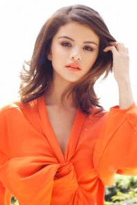
Karen: Selena, I absolutely love your attitude. I'm a bit less of a fan of the smile picture, though, because it makes you look very childish, and as one of the younger ladies that's something you definitely need to look out for. (It's not just you, though. We had similar issues with Dakota Fanning and Emma Watson in previous seasons.) But aside from that, I love the lighting and styling of this, and your makeup is very well done.
For the black and white, I wish you didn't have the logo in there. As a general rule, it's best if you can edit those out whenever possible, because they distract from you. It's also pretty small, but I like the outfit, and there's an unbelievable amount of attitude in the pose, so it's still pretty decent.
Nicki: It's hard to see a smile in your smile shot. We want something more like what's in your avatar. As for the black and white... the logo takes away from it, and we can't entirely see your face.


Amanda: Your Smile shot is cute, but it feels kind of forced. It seems like you're being told to smile, rather than doing it naturally. I like your hair and earrings, but the pose is kind of weird - especially your arm. Overall it's okay, not horrible, but not that great either.
The black and white one... I'm not totally sure how I feel about it. The pose is awkward and the hair is a bit too much - I want to like it for being something different, but it doesn't seem to fit with the hands behind the back. There's nothing really about this photo that sticks out to me due to the lack of color, and that's what you want to avoid. Again, it's average - it's at neither extreme, and I don't think you should be worried this week.
Karen: The smile is pretty cute. I love what you're doing with your hair, and the pose and accessories are simply adorable. Your eyes are definitely my favorite part of this photo.
As for the black and white, it definitely has a good artistic feel to it, but the facial expression is kind of off-putting, and the pose is just kind of... weird. I like the outfit and I like the hair, but those other elements make me kind of iffy.
Bingbing: I love the styling in the smile one. You look very classy and elegant but yet still commercial. But the pose especially the hand a little bit off for me. You should work on that.
But I think the B&W is one of my favorite this week. I think the styling is gorgeous and the concept is translatable. Your face is strong, full with attitude and your hair is wow.. My favorite part of this photo.
Matt: Yeah the smile does seem a bit forced like your in a bit of pain but it's still very sweet which i like
Black and White is festive and i like that as well. It's all over the place but in a good way!
Nicki: Can't say I'm a fan of the smile shot. It definitely looks forced. Your black and white is easily good enough to save you in my book. Love it!
Welcome to your First Judging Session. This cycle, we're going to face a lot of "Doubles" and this week, you girls have to deal with Double Theme.
Let's start our judging session
Matt: I love the smile It's so sweet and Innocent like you said. Perfect.
The Black and white one is just okay for me. I love your facial expression but i'm not really a fan of the dress.
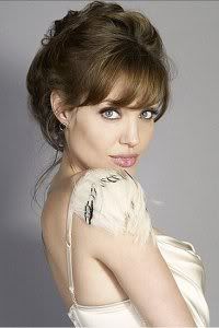
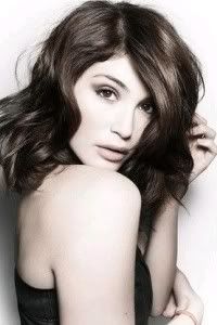
Karen: I definitely am surprised by the smile photo. Angelina usually looks so stiff and regal, so it's nice to something a little more innocent. I do wish that it was bit bigger, and that we could see more of your body, because it makes your arm a bit awkward, but it's a good shot overall.
The black and white is a bit more serious in nature, but it's a gorgeous high fashion shot, it showcases your sensuality very well, and the accessories really enhance your beauty nicely.
Amanda: I like both of these. The Smile shot is, as has already been said, sweet and innocent and definitely the kind of thing we wanted to see. The arm is a little awkward, and I'm wondering if Brad said something funny.
The black and white shot is good but not great. I'm not a fan of how you have your hair since it almost looks like you have a pixie cut, but I do like your dress and the setting. It's overall pretty good
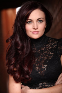
Bingbing: I think the smile one is very natural. You look really beautiful, sweet and fresh. I'm really impressed with you.
For the B&W, I must said that I'm not the biggest of fan of the photo because I think there's nothing catch my eye toward this photo. You just stand there and there were nothing memorable about it
Nicki: I really enjoy this smile shot. It's sweet and innocent just like you said!
The black and white is okay... I wish you were a little more fierce in it!
Amanda: Your smile is great, although a tad overdone. It's a pure head shot so you're front and center and your pearly whites steal all the attention. Good work!
The black and white I am uncertain about. You have a very fierce expression, but you're sort of covered up a bit too much by that scarf. I know someone is going to take a huge issue with it - and well I am too. The scarf is sort of the attention here - you're almost covering your mouth with it, and it just doesn't seem to fit. Everything else is good, but... the scarf robs it from being a solid photo. Nothing to worry about though!
Bingbing: I think you did great for the smile. The smile looks very natural and calm. I love the big hair. Very cute for you. Bey...
As for the B&W, I love the fact that you decide to use the same hairstyle. The eyes are intense. I love that. But the styling for me is a little bit off. You look "heavy" and the scarf kinda irritating me because it hide your neck. I WANT YOUR NECK!!!!
Matt: I'll agree i really love that your front and center. a little over done but still cute
B&w: I love your facial expression but i'm not fond of your crazy hair
Nicki: I love this smile shot. You're front and center and definitely a star.
The black and white shot is just okay. The scarf and hair take away from the fierceness of your look.
Karen: Alright, I'm running late and I don't wanna hold things up, so I'ma be brief. I think the smile is cute, and definitely shows off your face well. The hair is nice, but I've got a personal hatred for the afro style. It looks kooky and un-model-like, and I just don't like it.
The black and white is very intense, and you've got a great facial expression, but the scarf does hide you a bit, and that's unfortunate. Well done all around, though.
Matt: Hm, I'm not too sure what i think of this photo. The smile is sort of odd and the pose is just weird. I don't think its bad just doesnt work well for me.
This looks sepia and that's what did Kelly last season. Your facial expression looks like your kind of bored.
Amanda: Is that even a smile? You look like a movie villain here... and that evil grin is not the kind of "smile" we were hoping for.
For the B&W, Pretty much this. Although with you're and not your.Not really much else to say.
Nicki: I'm not a huge fan of this smile shot, either. It's very okay. You look more cunning here than anything else.
Nicki: I think black and white should be about fierce looks, and your look here is not fierce. Not a fan, sorry.
Karen: It's an interesting take on the smile, but I wish that this was more of a close-up on you, because we can't really see your face or hair terribly well. I think that with everything being black, we kind of lose your body a bit, too, which is unfortunate.
B&W - It's an interesting pose, but I don't really see the sepianess that you're all talking about. Maybe I'm colorblind. Either way, it's definitely not as coloured as Kelly's was, so I don't care. The facial expression could be a lot stronger, and I'm not really a fan of hats in general for these things, (sorry, Amanda!) but it ties in with the trench coat very well. The pose is strong, and it's reasonably sexy and high fashion, so my feelings are mostly positive.
Bingbing: I think the smile is very subtle. The pose didn't help you much either. But you have potential, Estella. I expected you to perform better than this. I think this is not Estella that I want because I think you're so gorgeous.
For the B&W, What is Sepia by the way? That word was really similiar to my mother's name, Sepiah.. I missed my mom. I need to call her asap. Back to your photo. Your face a little bit weak for me. I can't felt the energy. And the pose, you need to work on there more. You need to sharp it a little bit. This one is very average for me
Amanda: Very strong smile shot here, but that logo bugs me, as does your shirt. It looks like you're just wearing straps around you at first (you aren't). Overall, it's very good and seems very genuine.
The black and white... I don't know about it. The pose is strange and a bit too zoomed in, so I don't get a clear sense of what's going on here. The arm is just weird and I have no idea what you're holding. I'm also iffy on the lighting and what we can see of your face.
Your smile shot is definitely enough to get you good marks, so worry not!
Bingbing: For your smile shoot, I think you should tone it down a little bit. The smile is too wide for me and it look kinda corny for me. But the styling is great. I love the hair, earring and you look very commercial here.
And for the B&W, I like it. I think there's a story behind that photo. There are hope, love and calm elements in this one. You look very beautiful here.
Matt: Yeah I agree about the smile. Tone it down. It's nice but it's huge!
Black and white: I love it! It is really well and I can feel like it's speaking to me
Nicki: I'm a huge fan of your smile shot. It feels genuine, and that's what we want to see.
Your black and white has good and bad qualities. I don't like that I can't see all of your face, but the emotion translates well.
Karen: I agree about the weirdness of the smile's outfit. My first thought was that somebody tied you up, and you were outrageously happy about it, for some reason. But it's a cute smile, and I love your hair, so the outfit thing really isn't anything to worry about.
The black and white shot is absolutely gorgeous, and I love pretty much everything about it. It's alluring and vulnerable, and isn't too high fashion in the sense that we judges sit around going "gank" and have to figure out what the hell it's supposed to mean. Great job!
Amanda: Your Black and White photo is great - it's something different, though you look a bit too much like a statue. I know that's what you're going for, but it's not all about you. It's not lively. A black and white photo could make up for its lack of color by being lively, by being memorable.
Your smile photo... I find it creepy. Your face looks scary more than anything, especially due to how you're playing with your hair. I can't really bring myself to like it, though I don't think it's horrible. I get that you struggled with it, but I was expecting something a bit more... vibrant, for the word you used.
Bingbing: Yup I agree with Amanda, your B&W photo is so unique, The outfit and the setting really blend with each other. However I still think you can improve your face expression in this one
As for the smiling one, unlike Amanda, I like it. I really do. I can feel the energy from you and you look very fresh. I love that. I think a nice first week for you
Matt: Yeah I agree with the Black and White one. It's really good. It's very artsy.
The smile on the other hand isnt so great but it's still a smile!
Nicki:Black and White: I'm a huge fan of this photo. I love the uniqueness.
Smile: This is just okay. Your face seems low-res, or something. But you are certainly smiling!
Karen: The smile one is pretty cute, but the angle makes your arms look like Arnold Schwarzenegger's, which makes it a bit awkward. I like the hair and the smile itself, though, so no worries.
The black and white is very fierce, and I love how the camera angle contributes to that. I wish it was a tad bigger, but it's still very, very good.
Matt: two different photos and that's what i like about it.
The Smile is cute. Its good but not amazing.
The BW is sexy but i'm not a fan of your facial expression.
Amanda: Your smile seems overdone. We only see the top row of your teeth, and I think that makes it really awkward and unnatural. I don't love it, either, but it's at least decent.
The black and white pose is GREAT and quite memorable, but at the same time it's also kind of strange. Your face does bug me too, and the angle just doesn't fit well for some reason. It's not bad by any means, again just in the middle of the pack.
Bingbing: Yup the smile is too much and look awkward but you look fresh here which is why i'm quite impressed with this photo.
For the B&W, I agree with Amanda. I can see your potential here. The legs is really pretty. And the pose is very unique and memorable. Good Luck
Nicki: I think the smile is okay. Part of it seems somewhat forced. Just not entirely sure about it.
I love this black and white photo, however, SO fierce. SO sexy. Great job.
Karen: I like the smile, and the pose is good. We really focus on you, and that's exactly what we asked for. Great work!
The black and white I'm a little iffy on. The facial expression almost looks more annoyed than sensuous, which doesn't really line up with everything else that's going on here. The pose and the outfit are fantastic, though, so it's still a great shot.
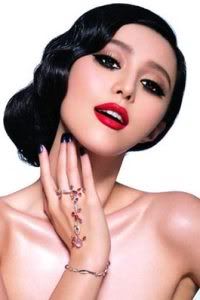
Bingbing: Helle Jennifer. Can I just call you JLaw? Love to see the First Timer. They are so fresh... As for your photo, I love the smile. It's not too much and the styling is great too. Very simple but yet still elegant. You look very classy here. My only advice is the tag. You should crop that part out. But I'm totally understand. This is your first time here. So it is forgiven
As for the B&W, I genuinely really impressed with you. You look like a Goddess here. Please nickname yourself Jathoteneus Goddess or something now.. The styling is very great. And your emotion totally contrast with your smile photo. I love this one
Amanda: I know you're a first timer, and you probably know that I'm critical of a lot of things xD
I'm not totally fond of the smile photo. The logo is distracting, but since this is your first time that's fine. The main issue I have is your eyes. They seem to be a bit of a contrast to your happy smile, so the photo ends up as somewhat neutral, somewhat forced. The smile is pretty, though, and that's what we want.
The black and white one... wowza. It's a very stunning, memorable photo, but I do have one issue with it - your face hardly takes the spotlight and that's due to the weird lighting. The glare on the right side is sort of a problem, because it distracts from you. The pose and outfit though are amazing, and this photo alone ensures that you are safe this week.
Matt: Your smile is cute but it's seems a little crooked/off but it's still very cute.
the BW one is amazing but like Amanda said the light is a bit distracting but still amazing.
Nicki: I think your smile is cute. It's good, but not great.
I love this black and white photo. It's fierce and you knocked it out of the park.
Karen: "Jathoteneus"? Bingbing, there aren't any sausages here! Anyway, I like the smile, but I feel like it's a little bit closed off, and not really genuine. But the hair is great, and I love that the necklace matches your eyes and really makes them pop. It's little things like that that turn a good picture into a great one.
The black and white is very artistic, but the glare on the right hand side kind of detracts from you a little. The pose is good and the outfit is spectacular, though, so great work!
Amanda: For your smile shot, it's really awkward. You look like you're just staring at the camera and opening your mouth like you're singing. Your eyes also bug the hell out of me. I don't see that as a smile. I don't know what it is, but I'm getting serious vibes from the first Taylor Swift way back in Cycle 1, who butchered the Smile theme similarly.
The black and white photo also doesn't do much for me. It's low quality, and it's also kind of... slutty. I do like your hair, but how it covers your eyes is kind of scary, especially when mixed with that facial expression. The garter belt is also a bit of a distraction since it's the darkest thing there, and that's not what you want it to be.
I'm going to take a guess here and say that you just chose the first images you came across and didn't think things through and compare them. That is NOT how you make it far in this competition. Don't rush things, scour and look them over. I do hope you take this advice to heart, but I think you could be in a lot of trouble this round...
Matt: Every thing about your smile picture is awkward. Your eyes are weird and when i look at your mouth i dont see much of a smile.
I like the black and white it's very cute and innocent.
Bingbing: Yup Kendra.. The smile one is not that good. Really awkward and the styling is off somewhere.
But, I genuinely like your B&W photo. I didn't expected it from you. The dress is gorgeous and I love your face. I can feel the attitude and you look really fierce here. Good job for this one
Karen: The smile one is definitely a bit questionable, and the outfit comes across as seriously skany to me, but I've seen worse.
The black and white is very impressive. You've got a nice sort of sultry look going, and I think the outfit and pose are both very nice.
Nicki: The smile shot comes across as skanky because the smile is awkward, and your dress is just too skimpy and distracting.
I think the black and white is all-right, but it needs higher resolution.
Matt: Your black and white is amazing...
your smiling on the other hand is a bit too cheesed out and it's just a tad awkward
Amanda: The black and white photo has a great backdrop - it's a great setting and a great pose, although the hat is kind of strange with it. It sort of makes your face even more awkward, if you know what I'm saying, but I really like it regardless.
I'm with Matty on the Smile one. It's cheesy and awkward, and the way you have your arm around your neck just doesn't seem to fit, and I know someone who is about to give you even more hell for that than I am. That aside, it's still at least okay, so I don't think you should be worried.
Karen: The black and white photo is simply amazing. I think the pose and the outfit are astounding, and the background is fantastic.
With the smile, though, it does seem a little bit forced, and it doesn't really look terribly much like you. But I like the lighting and the pose, and it's still pretty good. Well done!
Bingbing: I thought I see a nipple at first for you B&W but it's not and I've to agree with the judges. I love your confident in this photo. Yup, it's a little bit hoochie but that's your identity. The setting is undeniably beautiful.
As for the smile one, it's a little bit forced for me. I think you look ameteurish in this photo. I think you can do better than this
Nicki: I definitely see the smile as awkward. Just not enough genuine happiness.
The black and white photo is great, however, though I wish I could see a bit more of your face.
Amanda: I like the smile. I can't find anything wrong about it, but I also can't find anything too memorable about it. It's good, but not something that completely wows me. In the later rounds, as you're well aware, you're going to need to wow us, and this is enough to get by.
The black and white is good, but again not overly memorable. You're just staring at the camera, holding your hair. There's nothing unique to make up for the lack of color, and although that's not a problem, it's not a major one. The expression is good, not great, and the outfit is okay. There's really not much for me to say about it.
Bingbing: I think the smile one is very beautiful. You look very fresh and commercial in this one. The styling is very hip and young. Gorgeous.
I like your face for the B&W but the styling, dress especially look very average. It's okay but boring and not memorable at all.
Matt: The Smile is beautiful you look like the definition of a Barbie Doll... love the outfit
The black and white, It is very boring but it is an amazing black and white i like it.
Nicki: I think this smile shot is great. Everything just flows nicely and look natural- good job.
The black and white is just all right. I think you have a bit too much make up on, and there should be more focus on your face.
Karen: I love your smile in this! You look adorable, and everything from the pose to the outfit is just sweet and innocent. I really like it.
The black and white, I love the fierceness of your facial expression, and the hair is delightful, but the outfit really makes your entire body look weird, and the effect is really off-putting.
Bingbing: *Die, *Reborn, *Die, *Reborn... Stop!!! OMG!!! This is what I expected from you girl. The smiling one, you look very natural and beautiful, nothing awkward or force about that. The setting was brilliant. Very Commercial
Meanwhile for the B&W, I'm totally love the concept. Very artistic, fierce and memorable. Those other bitches are so going to hate you right now, cause you're the one to beat RiRi
Matt: I enjoy the smiling one a lot but the one thing i dont like is your pose it kind of takes attention away form your face. But your smile is very natural and i like that
B&W is sort of odd to me. It's well done but it just looks weird. Not bad though.
Amanda: I'm with Matt. The smile is great and very natural, but the hair and the pose sort of take the focus off of it. We want your face to be front and center, and here I notice your ass more than I notice your face.
I don't even know what to say about the Black and White. It's well done, but I don't know what you were going for here. It's artistic and memorable, but at the same time just plain strange. I want to like it, but I can't bring myself to. However, it's definitely enough to get you to the next round, and I hope you can kick ass like you did as Camilla!
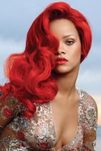
Karen: I think the smile photo is surprisingly cute. Rihanna usually looks fierce, but this is very cute and innocent. It's a nice pose, and I just love the style of it overall. The hair's a little bit weird, but... it kind of... always is, with you. So I'm just gonna let that slide, I think.
For the black and white, I do definitely see the high fashion vibe here, but this is almost overdone to the point of frighteningness. The makeup and the hair are very good, but the pose almost seems a bit too overtly sexual for me. Still, it's very interesting, and I like that you're taking risks.
Nicki: I love both of these photos. The smile is natural and cute, and the black and white is totally the opposite. It's crazy and fierce. Great job!
Amanda: The "best" smile? I can't even see it. Your expression is neutral in the first photo with a slight smirk. We want to see your pearly whites, we want to see some happiness. Here, you just seem content, not overly joyful, and that's going to hurt you.
Your black and white photo isn't very good, either. The biggest issue in that there's a watermark straight in the middle, and that takes the focus away from you, as does the logo at the bottom. Cut those things out! The pose is also really strange and it looks like you're about to fall over, and it's also kind of skanky...
Hate to say it, but I think you should be worried this week.
Bingbing: I think I love the simplicity in your smile. I think it's very natural and subtle but I still can feel your smile. Very commercial and fresh. Like this one
For you B&W, I feel the potential of this photo. Strong pose, gorgeous styling but Amanda's right. The watermark is kinda ruined this photo. I think if we close up on your face, it's pretty amazing. Right now, I think you should try to avoid the photo with watermark or remove it (Is it possible?)
Matt: Hm, i love the smile but i hate it! I have to agree with Amanda on the teeth part, i wish i could see more.
The black and white isnt something i'd expect from you. Very mature and i like it a lot. I'll agree that the watermark is a bit distracting but it's still a good picture.
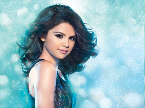
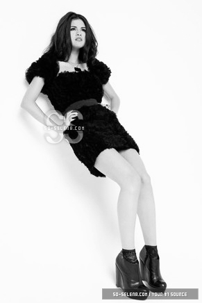
Karen: Selena, I absolutely love your attitude. I'm a bit less of a fan of the smile picture, though, because it makes you look very childish, and as one of the younger ladies that's something you definitely need to look out for. (It's not just you, though. We had similar issues with Dakota Fanning and Emma Watson in previous seasons.) But aside from that, I love the lighting and styling of this, and your makeup is very well done.
For the black and white, I wish you didn't have the logo in there. As a general rule, it's best if you can edit those out whenever possible, because they distract from you. It's also pretty small, but I like the outfit, and there's an unbelievable amount of attitude in the pose, so it's still pretty decent.
Nicki: It's hard to see a smile in your smile shot. We want something more like what's in your avatar. As for the black and white... the logo takes away from it, and we can't entirely see your face.
Amanda: Your Smile shot is cute, but it feels kind of forced. It seems like you're being told to smile, rather than doing it naturally. I like your hair and earrings, but the pose is kind of weird - especially your arm. Overall it's okay, not horrible, but not that great either.
The black and white one... I'm not totally sure how I feel about it. The pose is awkward and the hair is a bit too much - I want to like it for being something different, but it doesn't seem to fit with the hands behind the back. There's nothing really about this photo that sticks out to me due to the lack of color, and that's what you want to avoid. Again, it's average - it's at neither extreme, and I don't think you should be worried this week.
Karen: The smile is pretty cute. I love what you're doing with your hair, and the pose and accessories are simply adorable. Your eyes are definitely my favorite part of this photo.
As for the black and white, it definitely has a good artistic feel to it, but the facial expression is kind of off-putting, and the pose is just kind of... weird. I like the outfit and I like the hair, but those other elements make me kind of iffy.
Bingbing: I love the styling in the smile one. You look very classy and elegant but yet still commercial. But the pose especially the hand a little bit off for me. You should work on that.
But I think the B&W is one of my favorite this week. I think the styling is gorgeous and the concept is translatable. Your face is strong, full with attitude and your hair is wow.. My favorite part of this photo.
Matt: Yeah the smile does seem a bit forced like your in a bit of pain but it's still very sweet which i like
Black and White is festive and i like that as well. It's all over the place but in a good way!
Nicki: Can't say I'm a fan of the smile shot. It definitely looks forced. Your black and white is easily good enough to save you in my book. Love it!

 I promise I will bring my A game next week

 bye Kendra