Post by Bingbing Fan on Nov 29, 2011 12:17:35 GMT -5
Hello Girls!!! This is the moment for us to find out which 3 girls will compete in the Finale next week.
Let's start our judging session!!!!
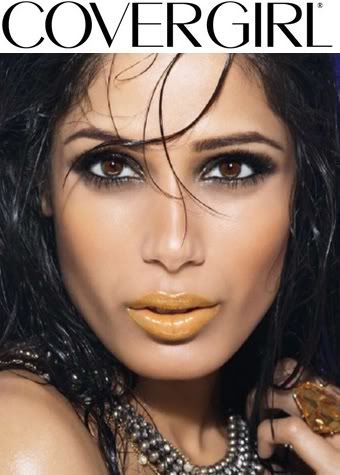
Amanda: This is... uhhhhhh. I have no idea what to say. Uhh sorry.
Nicki: Frieda, I'm sorry, but I really don't like this lipstick color on you. It just looks like caramel.
Karen: I'm not so much a fan of the lips, if only because the color is a bit off-putting, but I definitely think that you made the right move in choosing a photo that makes us focus on the mouth. The rest of the makeup is good, the eyes are good, and I like the hair a lot, so overall it's positive for me.
BB: I think this is not your best photo but I really like your lips here. I think your lips are great but my problem is with the whole photo. It was odd and look like it was badly cropped
Matt: I like the lips it makes your lips stand out and then i just look at everything around it. So i think its a great photo.
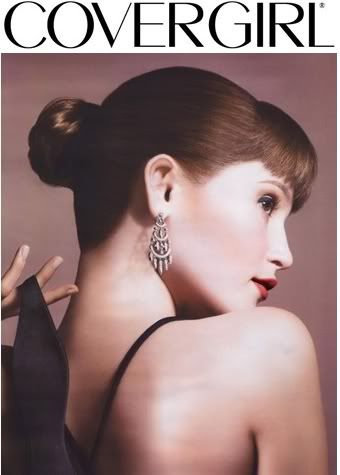
Amanda: This is extremely unique, really. The biggest issue here is that we hardly see your FACE, and CoverGirl shots are about the FACE. That's a really big problem here, though your lips stand out wonderfully because of that vivid red lipstick. The pose is unique and the earring there is great. I'm just not sure if this is the kind of ad we're after... which is unfortunate. You know I'm a fan of yours, and I don't want to see you go.
Nicki: Gemma, I'm sorry, but I'm not big on this. You used the same filter as last week, and cover girl shots are normally clear and focus on your face. This doesn't really do either. I think you might be in trouble this week :/
Karen: I'm not a fan of the over-the-shoulder look, if only because it's so far removed from what a typical Covergirl shot ought to be. I do, however, like the photo, and it definitely draws attention to the lips, so it's kind of a toss-up for me. Good luck, whatever the outcome.
BB: Gemma, if you look at the camera, this is so going to be my favorite photo of the week because I really like your style and the lips look wonderful. It's really risky to go with profile for the Covergirl campaign
Matt: I was really pulling fro you. THis would have been a good shoot but not for covergirl. I do have the say the lipstick stands out but i want to see all of your face.
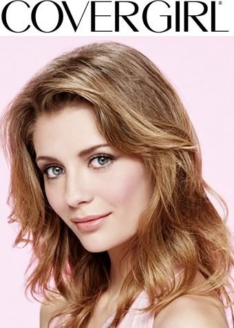
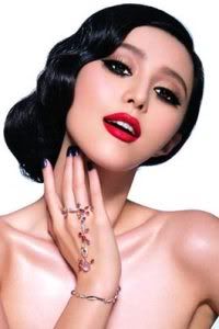
Amanda: This is really cute. Your eyes really stand out to me here and suck me in, though the lips also get my attention too. I think this is a great shot that's true to CoverGirl and it does work for the lipstick - your eyes are naturally beautiful and you don't have the makeup around them, and you focused on advertising the product. Overall, this is great!
Nicki: Mischa, this is just okay for me. I didn't get anyting special from this, but it's cute.
Karen: I think this is a pretty good shot. I don't really get the focus on the lipstick so much, which is unfortunate, but everything else in the photo really works well. Great work!
BB: I'm not sure about this, Mischa... I agreed with Nicki that there's nothing special about this. I really thought you're going to rule this week because you're the most commercial in this competition now.
Matt: This is so adorable and you totally nailed the topic this week. I love your face, thats all i can say!
Amanda: This is a stunning shot, but it's too close up. We can't see all of your head, and that's a bit of a problem. I like how you have the CoverGirl in there already. It looks like a genuine ad, I just wish we could see a little more - it's too zoomed in and because of that, your lips are more towards the bottom and that takes the focus off of them. This is still great, don't get me wrong. It's just that at this stage, the cropping could hurt you a bit too much...
Nicki: I agree with Amanda- the shot's great, but it's just a tad too zoomed in.
Karen: I definitely agree about the zoom-in factor. Usually Covergirl shots are portrait-style, with a focus on a specific aspect of the makeup. Still, it's a good shot, so well done!
BB: Damn, I've to agree with the girls. It was too close!!! I mean, Covergirl Ad isn't just about your product. We want to see the other features like your hairstlye, the way you posed, but this is just too close.
Matt: Yeah, too close up. That's usually the downfall in this with models is the one that is too close up but i think your fine.
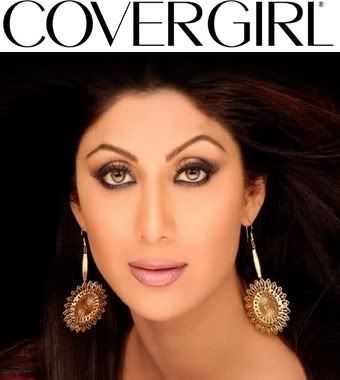
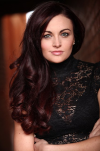
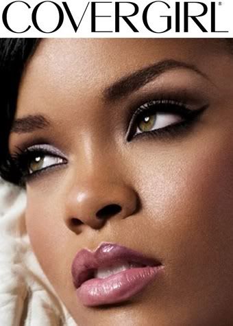
Amanda: The product here is the lipstick. I notice three things here before I do your lips: Your eyes and the makeup around them, your hair being so spread out, and those golden earrings. Your focal point here is to be the LIPS, and although this shot is gorgeous, I see the lips later. This seems to be more of a CoverGirl ad for a mascara or eyeshadow product. I really like the shot, but at this point not going with the theme hurts a LOT
Nicki: Shilpa, this is just okay for me. Again, the earrings really detract from your lips.
Karen: I think that this is definitely a good photo, but there really isn't that much of a focus on the lips, which is really too bad. It's not terrible, but it's not particularly asounding, either...
BB: I didn't like the background here. And yes, the earrings is too over the top. But other than that. I think your face is great. Very commercial and your look very commercial here
Matt: I really like this. Great job. But i do go right to your eyes and not your mouth but its still good.
Let's start our judging session!!!!
Amanda: This is... uhhhhhh. I have no idea what to say. Uhh sorry.
Nicki: Frieda, I'm sorry, but I really don't like this lipstick color on you. It just looks like caramel.
Karen: I'm not so much a fan of the lips, if only because the color is a bit off-putting, but I definitely think that you made the right move in choosing a photo that makes us focus on the mouth. The rest of the makeup is good, the eyes are good, and I like the hair a lot, so overall it's positive for me.
BB: I think this is not your best photo but I really like your lips here. I think your lips are great but my problem is with the whole photo. It was odd and look like it was badly cropped
Matt: I like the lips it makes your lips stand out and then i just look at everything around it. So i think its a great photo.
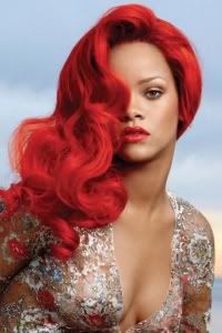
Amanda: This is extremely unique, really. The biggest issue here is that we hardly see your FACE, and CoverGirl shots are about the FACE. That's a really big problem here, though your lips stand out wonderfully because of that vivid red lipstick. The pose is unique and the earring there is great. I'm just not sure if this is the kind of ad we're after... which is unfortunate. You know I'm a fan of yours, and I don't want to see you go.
Nicki: Gemma, I'm sorry, but I'm not big on this. You used the same filter as last week, and cover girl shots are normally clear and focus on your face. This doesn't really do either. I think you might be in trouble this week :/
Karen: I'm not a fan of the over-the-shoulder look, if only because it's so far removed from what a typical Covergirl shot ought to be. I do, however, like the photo, and it definitely draws attention to the lips, so it's kind of a toss-up for me. Good luck, whatever the outcome.
BB: Gemma, if you look at the camera, this is so going to be my favorite photo of the week because I really like your style and the lips look wonderful. It's really risky to go with profile for the Covergirl campaign
Matt: I was really pulling fro you. THis would have been a good shoot but not for covergirl. I do have the say the lipstick stands out but i want to see all of your face.
Amanda: This is really cute. Your eyes really stand out to me here and suck me in, though the lips also get my attention too. I think this is a great shot that's true to CoverGirl and it does work for the lipstick - your eyes are naturally beautiful and you don't have the makeup around them, and you focused on advertising the product. Overall, this is great!
Nicki: Mischa, this is just okay for me. I didn't get anyting special from this, but it's cute.
Karen: I think this is a pretty good shot. I don't really get the focus on the lipstick so much, which is unfortunate, but everything else in the photo really works well. Great work!
BB: I'm not sure about this, Mischa... I agreed with Nicki that there's nothing special about this. I really thought you're going to rule this week because you're the most commercial in this competition now.
Matt: This is so adorable and you totally nailed the topic this week. I love your face, thats all i can say!
Amanda: This is a stunning shot, but it's too close up. We can't see all of your head, and that's a bit of a problem. I like how you have the CoverGirl in there already. It looks like a genuine ad, I just wish we could see a little more - it's too zoomed in and because of that, your lips are more towards the bottom and that takes the focus off of them. This is still great, don't get me wrong. It's just that at this stage, the cropping could hurt you a bit too much...
Nicki: I agree with Amanda- the shot's great, but it's just a tad too zoomed in.
Karen: I definitely agree about the zoom-in factor. Usually Covergirl shots are portrait-style, with a focus on a specific aspect of the makeup. Still, it's a good shot, so well done!
BB: Damn, I've to agree with the girls. It was too close!!! I mean, Covergirl Ad isn't just about your product. We want to see the other features like your hairstlye, the way you posed, but this is just too close.
Matt: Yeah, too close up. That's usually the downfall in this with models is the one that is too close up but i think your fine.
Amanda: The product here is the lipstick. I notice three things here before I do your lips: Your eyes and the makeup around them, your hair being so spread out, and those golden earrings. Your focal point here is to be the LIPS, and although this shot is gorgeous, I see the lips later. This seems to be more of a CoverGirl ad for a mascara or eyeshadow product. I really like the shot, but at this point not going with the theme hurts a LOT
Nicki: Shilpa, this is just okay for me. Again, the earrings really detract from your lips.
Karen: I think that this is definitely a good photo, but there really isn't that much of a focus on the lips, which is really too bad. It's not terrible, but it's not particularly asounding, either...
BB: I didn't like the background here. And yes, the earrings is too over the top. But other than that. I think your face is great. Very commercial and your look very commercial here
Matt: I really like this. Great job. But i do go right to your eyes and not your mouth but its still good.