Post by Bingbing Fan on Nov 18, 2011 12:38:55 GMT -5
Hello Girls..
Welcome to the Redemption Judging. Two girls with the highest overall score from Photoshoot #1 to Photoshoot #5B will reenter the competition
Let's start our judging session

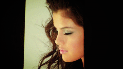
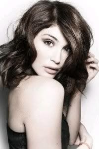
Karen: Hmm. I'm not really getting a terribly greedy vibe from this. You look more comatose than anything, and that's unfortunate. The lack of color in the photo makes it pretty hard to get a good sense of your outfit, too. Good luck, though!
Amanda: I too see sloth more than greed. You aren't particularly interested in anything around you, and I am with Karen about the lack of color. I really don't get much of any impression from this. As much as I want to root for you, this isn't as good as it could be
BB: When I saw this photo in your samples, I thought about greed so I think the theme was executed well enough. I'm not a fan of your photo for previous three rounds but this week, i like your photo. But yes, I do agree with other judges about certain things. It's not perfect but still good for me
Nicki: I don't see greed here at all, sorry.

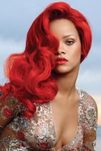
Amanda: I love this. High-fashion, sophisticated, and the pose and face are great. The only issue I have is that it is kind of plain, but at least the lipstick and shoes add a little touch that isn't overwhelming. Pretty good job overall!
BB: I think the pose is weak, but the face alone is enough for me to consider this a good photo. But Amanda's right. This was just too plain..
Matt: I like this from all of your other's that i have seen. I'm proud of you girl!
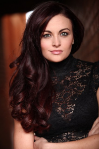
Karen: I like it. The coloring is really well done, and the redness keeps it from being too bland. The hair is a bit random and doesn't really fit with the rest of the picture, but the facial expression is fierce. Well done!
Nicki: My biggest problem with this is your face. Your expression is very weak. Otherwise, I think it's great!

BB: I'm really torn about this photo. I really want to like it because I know how much effort you put on this but there just something off that really bother me. The concept of this photoshoot. I saw your face much stronger before this.. I hope your previous photoshoot is enough to bring you back in the game
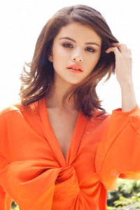
Amanda: There are too many colors here for a shoot that is supposed to invoke a single color. Your bikini is yellow and the grass and palm leaves are green. The heels also don't really fit and the pose is just okay. Your face is good and I like your hair but aside from that, this really isn't what we were hoping for. Sorry, but good luck anyway.
Matt: I don't want to be negative but i'm not really a fan. I do love the blue coloring of everything but there is something about your face that i dont like
Karen: I agree on the color issue. It's not really uniform, which is tragic, because it's a powerful pose, and I like the outfit. Not a fan of the face, because it seems a bit... off... but overall it's not bad.
Nicki: I think it would have done wonders to rework some of the colors here. Otherwise, it's just okay.

BB: This is much better from the first one. I feel the Spring vibe. I don't think the lightning angle was good, because we can't see your face clear. But overall, I think you redeem yourself girl
Amanda: I actually liked your original one a bit more and don't think you should've left then. This... I don't really like. The lighting isn't very good, and your dress is a bit too much for me. The garter belt does help, though, but I don't really feel this. It makes me sad
Matt: yeah i was a fan of the original one... this one is great too i just dont like how the light is blocking your face.
Nicki: It's already been said, but my main issue here is the lighting
Welcome to the Redemption Judging. Two girls with the highest overall score from Photoshoot #1 to Photoshoot #5B will reenter the competition
Let's start our judging session
Karen: Hmm. I'm not really getting a terribly greedy vibe from this. You look more comatose than anything, and that's unfortunate. The lack of color in the photo makes it pretty hard to get a good sense of your outfit, too. Good luck, though!
Amanda: I too see sloth more than greed. You aren't particularly interested in anything around you, and I am with Karen about the lack of color. I really don't get much of any impression from this. As much as I want to root for you, this isn't as good as it could be
BB: When I saw this photo in your samples, I thought about greed so I think the theme was executed well enough. I'm not a fan of your photo for previous three rounds but this week, i like your photo. But yes, I do agree with other judges about certain things. It's not perfect but still good for me
Nicki: I don't see greed here at all, sorry.
Amanda: I love this. High-fashion, sophisticated, and the pose and face are great. The only issue I have is that it is kind of plain, but at least the lipstick and shoes add a little touch that isn't overwhelming. Pretty good job overall!
BB: I think the pose is weak, but the face alone is enough for me to consider this a good photo. But Amanda's right. This was just too plain..
Matt: I like this from all of your other's that i have seen. I'm proud of you girl!
Karen: I like it. The coloring is really well done, and the redness keeps it from being too bland. The hair is a bit random and doesn't really fit with the rest of the picture, but the facial expression is fierce. Well done!
Nicki: My biggest problem with this is your face. Your expression is very weak. Otherwise, I think it's great!
BB: I'm really torn about this photo. I really want to like it because I know how much effort you put on this but there just something off that really bother me. The concept of this photoshoot. I saw your face much stronger before this.. I hope your previous photoshoot is enough to bring you back in the game
Amanda: There are too many colors here for a shoot that is supposed to invoke a single color. Your bikini is yellow and the grass and palm leaves are green. The heels also don't really fit and the pose is just okay. Your face is good and I like your hair but aside from that, this really isn't what we were hoping for. Sorry, but good luck anyway.
Matt: I don't want to be negative but i'm not really a fan. I do love the blue coloring of everything but there is something about your face that i dont like
Karen: I agree on the color issue. It's not really uniform, which is tragic, because it's a powerful pose, and I like the outfit. Not a fan of the face, because it seems a bit... off... but overall it's not bad.
Nicki: I think it would have done wonders to rework some of the colors here. Otherwise, it's just okay.
BB: This is much better from the first one. I feel the Spring vibe. I don't think the lightning angle was good, because we can't see your face clear. But overall, I think you redeem yourself girl
Amanda: I actually liked your original one a bit more and don't think you should've left then. This... I don't really like. The lighting isn't very good, and your dress is a bit too much for me. The garter belt does help, though, but I don't really feel this. It makes me sad

Matt: yeah i was a fan of the original one... this one is great too i just dont like how the light is blocking your face.
Nicki: It's already been said, but my main issue here is the lighting


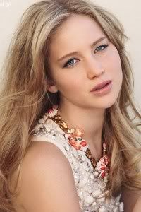
 congrats to JLaw too!
 Congrats girls!!!